Introduction
Vertical alignment on the website was a challenge for every coder. Coders used various hacks or adding no semantic code for it. Times have changed and coders have a pretty good support for Flexbox layout.
Test support for Flexible layout on your browser.
With Flexible layout you can align inner elements horizontally and vertically. There are a lot of properties with strange names. For a perfect understanding of layout you need to read the boring documentation. See reference at the end of this post.
Examples
Example 1: Center of element
In this example, you can conveniently use property margin:auto on child element. Another option is to use flex properties justify-content:center and align-items:center.
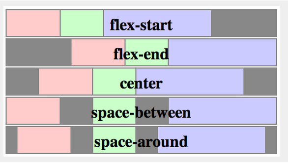
Example 2: Navigation
See property justify-content. Maybe you will be interested and other values: flex-start | flex-end | center | space-between | space-around. If you have set height of navigation, you can consider property align-items:center for vertical centering.
Example 3: Products
The property flex-wrap determine wrapping at the end of line.
Properties
flex container
display: other values | flex | inline-flex;
flex-direction
Row or column. It defines the main-axis.
flex-direction: row | row-reverse | column | column-reverse
flex-wrap
Single-line or multi-line.
flex-wrap: nowrap | wrap | wrap-reverse
flex-flow
This is a shorthand for flex-direction and flex-wrap properties.
justify-content
It defines the alignment along the main axis.
justify-content: flex-start | flex-end | center | space-between | space-around
source: http://www.w3.org/TR/css3-flexbox/
align-items
This defines the default behaviour for how flex items are laid out along the cross axis on the current line.
align-items: flex-start | flex-end | center | baseline | stretch
source: http://www.w3.org/TR/css3-flexbox/
align-content
This aligns a flex container's lines within when there is extra space in the cross-axis, similar to how justify-content aligns individual items within the main-axis.
align-content: flex-start | flex-end | center | space-between | space-around | stretch

source: http://www.w3.org/TR/css3-flexbox/
order (flex item)
Controls the order in which they appear in their container.
order: number
flex-grow (flex item)
It dictates what amount of the available space inside the flex container the item should take up.
flex-grow: (default 0)
flex-shrink (flex item)
This defines the ability for a flex item to shrink if necessary.
flex-shrink: (default 1)
flex-basis
This component, which takes the same values as the width property, sets the flex-basis longhand and specifies the flex basis.
flex-basis: | auto (default auto)
Resources: