Showing posts with label css. Show all posts

Saturday, November 28, 2020

How to use Flexbox in Bootstrap

As I wrote earlier a flexbox is a toll for building layouts with CSS. It is one-dimensional layout compared to CSS Grid. Bootstrap v.4 used flexbox for building layout too. Therefore, if you use the Bootstrap grid in your projects, it is good to know the basic concepts of this tool.

The main element is refered as flex container, and the elements inside it are flex items. 

Friday, November 28, 2014

Applying clipping to elements in CSS

The clip property is deprecated now. The new, recommend version of applying clipping to elements in CSS is clip-path.

Clip property has two significant weaknesses:
  1. Element has to be positioned as absolute.
  2. Clip can only do rectangles.

The clip-path property solves the weaknesses. The clip-path property can be applied to all HTML elements and SVG container elements. The clip-path property takes any graphical element from SVG or basic shapes from CSS and uses them as clipping region.


The clip-path property do not require any SVG markup. You can use basic shapes from CSS. They were added to clip-path to provide easy shorthand functions for simple clipping operations.

  • inset(top right bottom left [ round border-radius ]?)
  • circle(r? [ at position ]?)
  • ellipse(rx ry? [ at position ]?)
  • polygon(x1 y1, x2 y2, ..., xn yn)


Animating/Transitioning clip-path
Basic shapes can be animated. The following example uses hover effect. Animation of basic shapes works fine when it is applied to the same shape.


Resources
Clippy - CSS clip-path maker

Tuesday, March 18, 2014

CSS Gradients

Using gradients declared in CSS, rather using an actual image file, is better for control and performance. Notation of CSS gradients in browsers was changed several times. We hope that today's notation for CSS Gradients already remains unchanged. On the other hand, the signature of CSS Gradient methods are from the perspective of a programmer terrible.

The gradient method is defined as the value of the background-image.


We can use:
  • Linear gradients
  • Radial gradients
  • Repeating Gradients


You can look at support of CSS Gradients in your browser:


Linear Gradient


/**
* Draw linear gradient
* @param {String=} direction - (“to ” + ( top | right | bottom | left ) | number + ( ‘deg’ | ‘rad’ ))
* @param {...String} color - color | color + stop-color
*/
linear-gradient( direction, color_1, color_2, color_n)


Stop-color is the border, where the previous color ends and the new color begins.


Direction
  • top: 0
  • right: 90deg
  • bottom: 180deg
  • left: 270deg


Radial gradient


/**
* Draw radial gradient
* @param {String=} shape_direction - (ellipse | circle) | (ellipse | circle) + ‘at ’ + ( top | right | bottom | left )
* @param {...String} color - color | color + stop-color
*/
radial-gradient( shape_direction, color_1, color_2, color_n)


Repeating Gradient


  • repeating-linear-gradient
  • repeating-radial-gradient


The size of the gradient is determined by the final stop-color.


Reference


Tuesday, February 18, 2014

Flexbox layout

Introduction

Vertical alignment on the website was a challenge for every coder. Coders used various hacks or adding no semantic code for it. Times have changed and coders have a pretty good support for Flexbox layout.


With Flexible layout you can align inner elements horizontally and vertically. There are a lot of properties with strange names. For a perfect understanding of layout you need to read the boring documentation. See reference at the end of this post.


Examples


Example 1: Center of element
In this example, you can conveniently use property margin:auto on child element. Another option is to use flex properties justify-content:center and align-items:center.


Example 2: Navigation
See property justify-content. Maybe you will be interested and other values:  flex-start | flex-end | center | space-between | space-around. If you have set height of navigation, you can consider property align-items:center for vertical centering.


Example 3: Products
The property flex-wrap determine wrapping at the end of line.


Properties


flex container
display: other values | flex | inline-flex;


flex-direction
Row or column. It defines the main-axis.


flex-direction: row | row-reverse | column | column-reverse


flex-wrap
Single-line or multi-line.


flex-wrap: nowrap | wrap | wrap-reverse


flex-flow
This is a shorthand for flex-direction and flex-wrap properties.


justify-content
It defines the alignment along the main axis.


justify-content: flex-start | flex-end | center | space-between | space-around
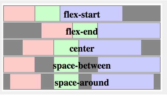

source: http://www.w3.org/TR/css3-flexbox/


align-items
This defines the default behaviour for how flex items are laid out along the cross axis on the current line.


align-items: flex-start | flex-end | center | baseline | stretch
source: http://www.w3.org/TR/css3-flexbox/


align-content
This aligns a flex container's lines within when there is extra space in the cross-axis, similar to how justify-content aligns individual items within the main-axis.


align-content: flex-start | flex-end | center | space-between | space-around | stretch

source: http://www.w3.org/TR/css3-flexbox/


order (flex item)
Controls the order in which they appear in their container.


order: number


flex-grow (flex item)
It dictates what amount of the available space inside the flex container the item should take up.


flex-grow: (default 0)


flex-shrink (flex item)
This defines the ability for a flex item to shrink if necessary.


flex-shrink: (default 1)


flex-basis
This component, which takes the same values as the width property, sets the flex-basis longhand and specifies the flex basis.


flex-basis: | auto (default auto)


Resources: